The Project
St Cross Hospital, Rugby – comprehensive wayfinding signage solution. Design, supply and installation.
As a historic NHS site, the hospital has developed over time and expanded in order to offer various services. As a result, the signage was outdated and there was a combination of old and new that was no longer fit for purpose. The overall service that the hospital provides is comprehensive and the signage needed to be updated to reflect this.
The Trust commissioned Graphic Signs to design, implement and install a wayfinding system that would tie everything together to cover both internal and external areas. The goal was to make the site feel unified and complete, regardless of the areas you were visiting.
Overall, the entire internal and external wayfinding system needed to be fully reviewed, designed, manufactured, and installed. The Graphic Signs team was involved from the start of the project and provided a full service. We worked alongside the hospital in an initial review of the current signage system and conducted the site surveys that helped to develop a new structure and site map to support the planning throughout the project.

The Brief
The project required the updating of some of the signage that already existed but there were also requirements for new signage to be placed in locations that had yet to be decided. To improve the patient experience of the hospital, the Graphic Signs team were asked to do a complete overhaul of the post-mounted signage and internal wayfinding.
As part of the review, we worked closely with the Trust and multiple stakeholder groups including the local volunteer Patient and Public Involvement (PPI) group, the NHS communications team, the site estates team. Inclusivity was key to this project’s success. We were able keep these groups informed of the process of the project but they were also able to help us understand their point of view and take their suggestions into account during the planning process.
The PPI group was able to give us their views and help us to understand current difficulties of patients and visitors to the hospital. This enabled us to take these measures into account when planning the signage structure.
The NHS comms team was able to act proactively to keep all patients and staff informed as there were temporary measures in place at times throughout the project. It was vital to liaise with the comms team regularly to keep information flowing. By providing key information and helping patients understand what to expect we were able to reduce worry and anxiety during their visits. Through continuous and consistent messaging, patients and staff were briefed throughout the process and brought along on the journey to ease a period of change.
The Result
Although the weather decided to play tricks on us, we were able to proceed with installation on one of the coldest weeks of the year.
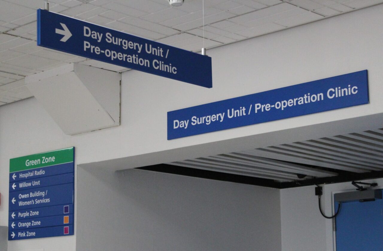
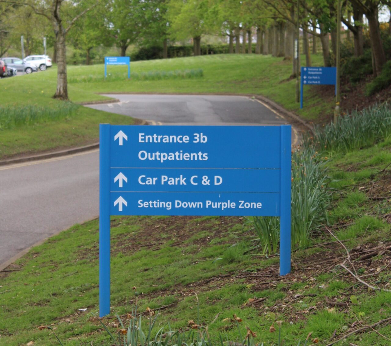
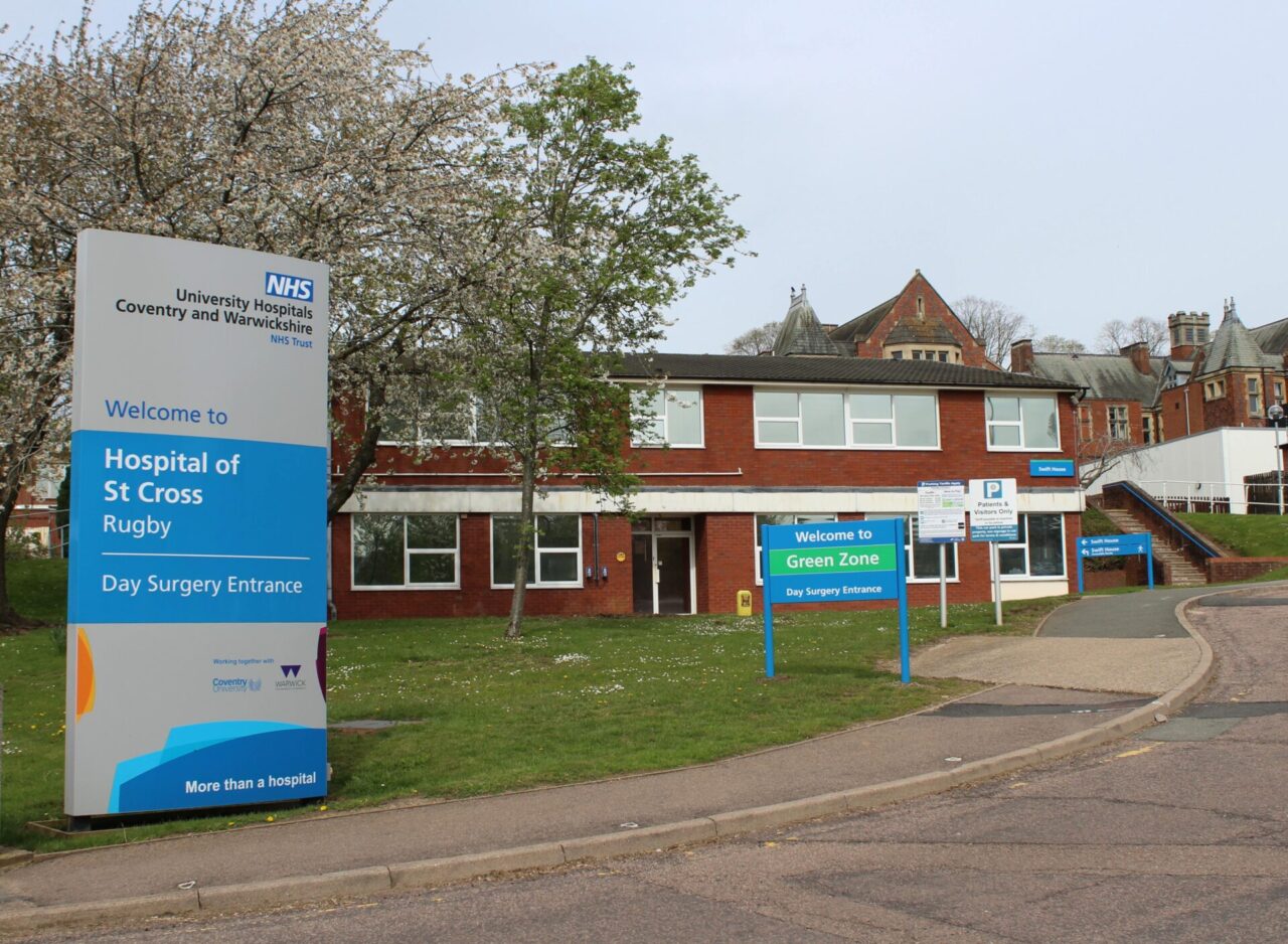
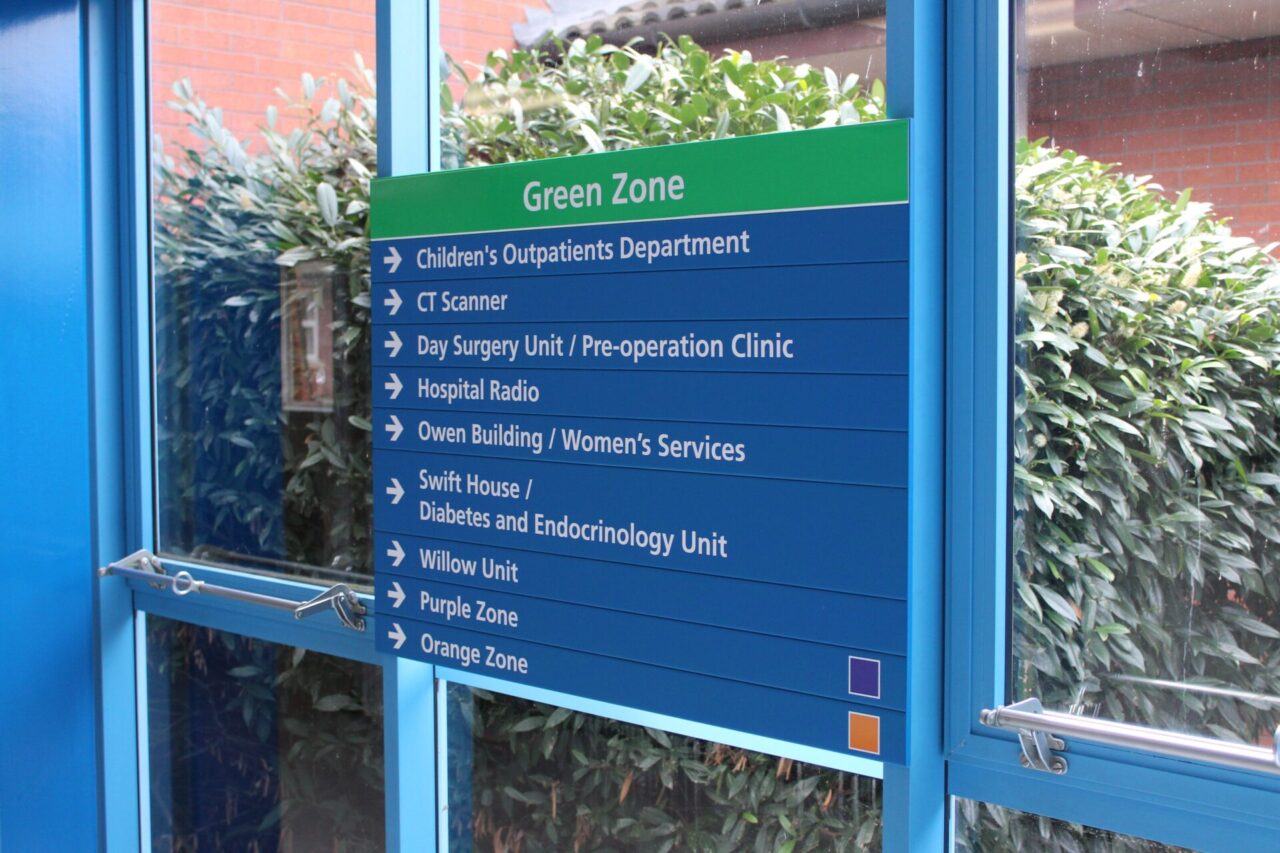
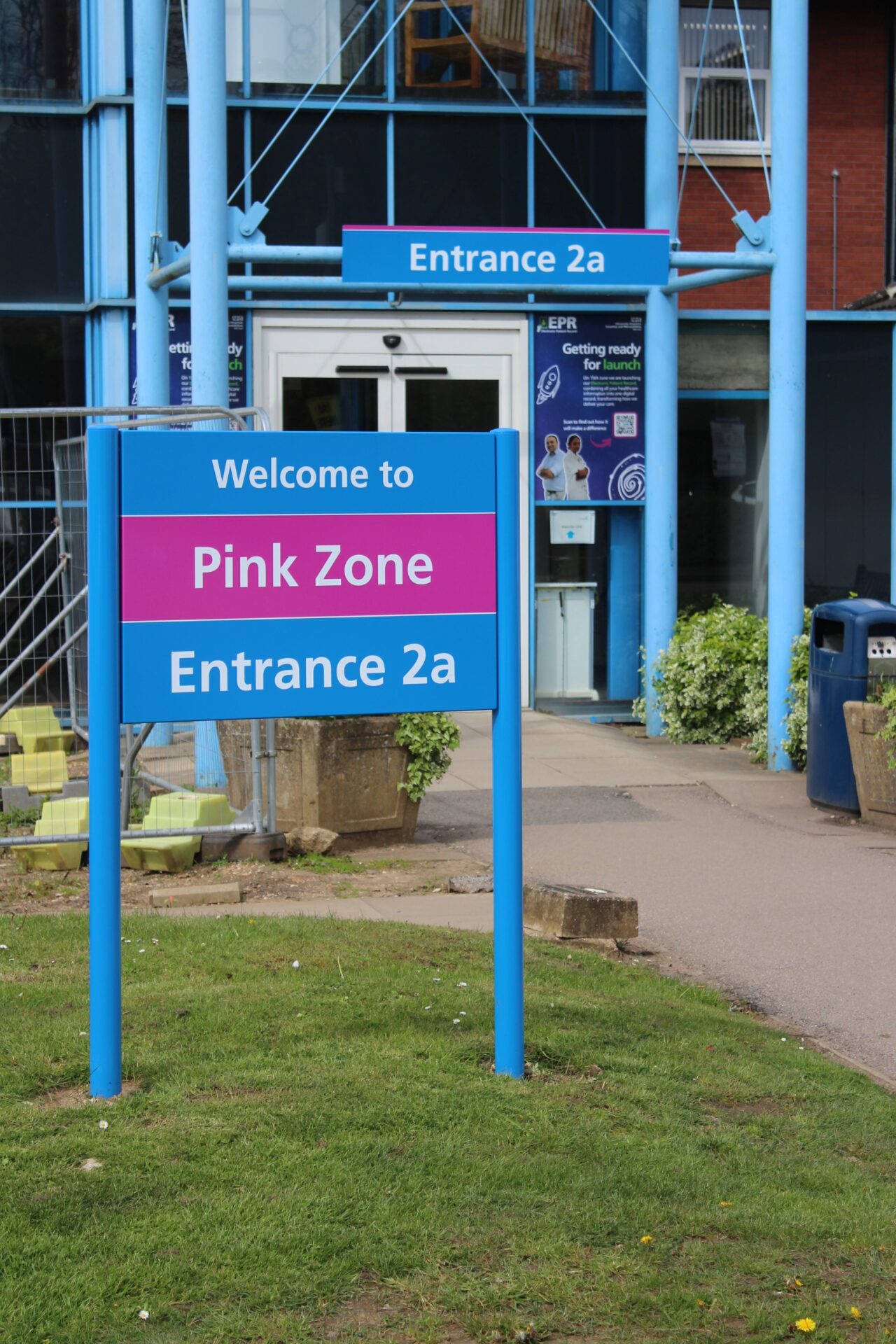
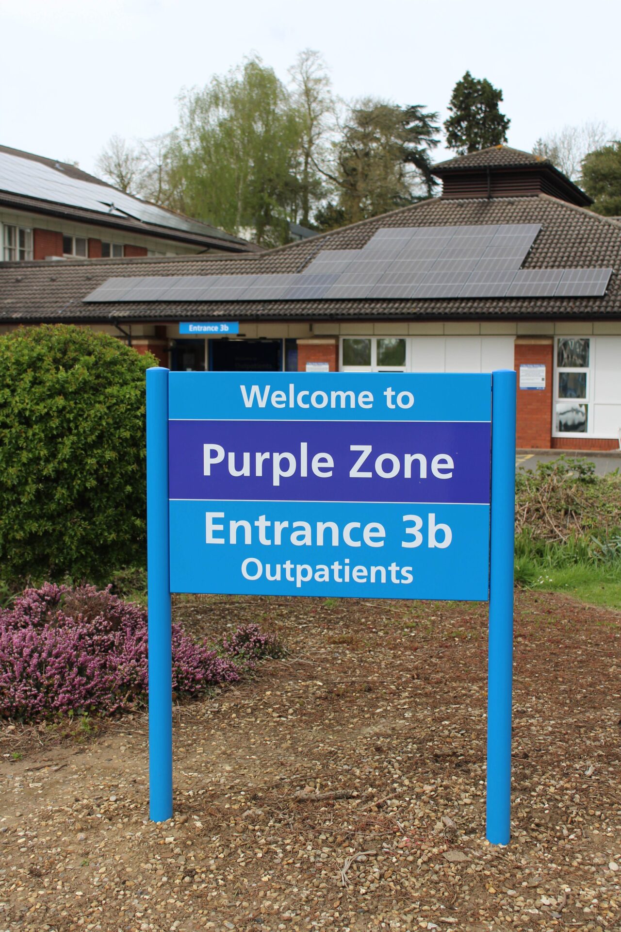
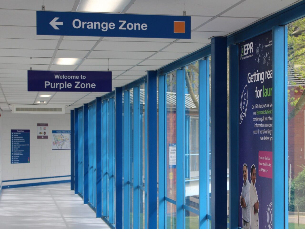
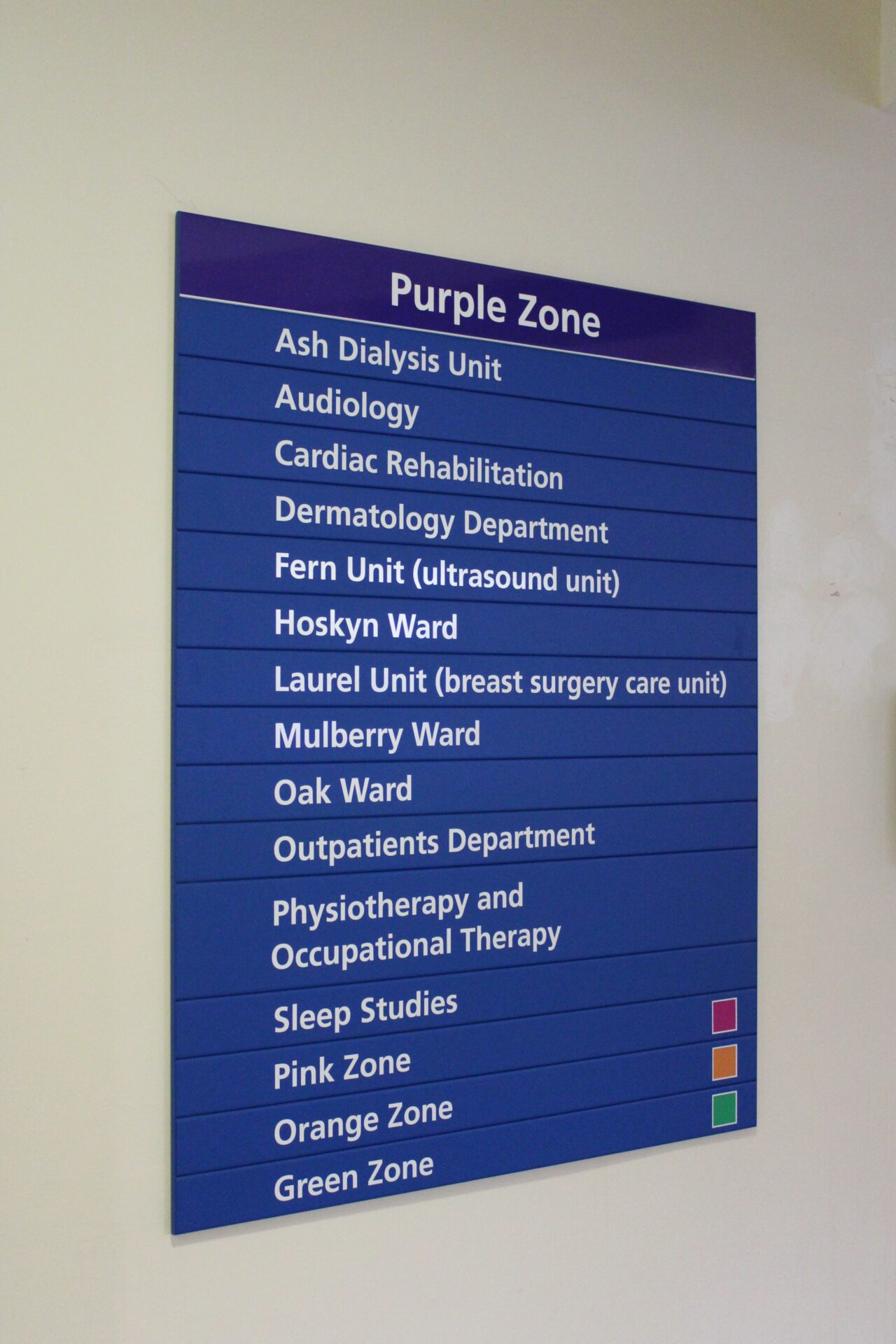
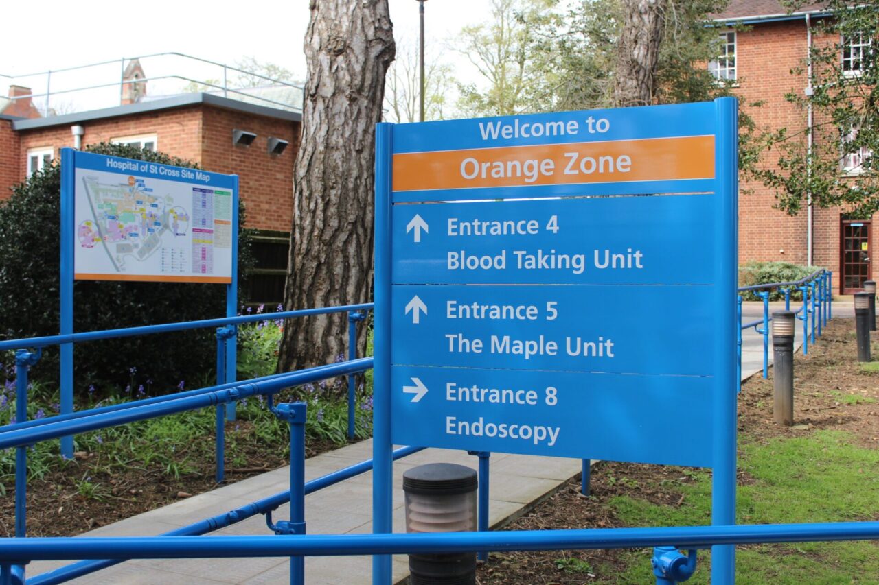
The Graphic Signs team was able to divide the hospital site into four zones that could be easily colour coded. The use of colour visually communicated the navigation of the site for parking and all directional signage. It created a seamless visual way for the signage to come together so that it was easy to follow at a glance.
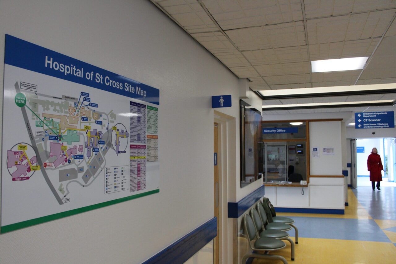
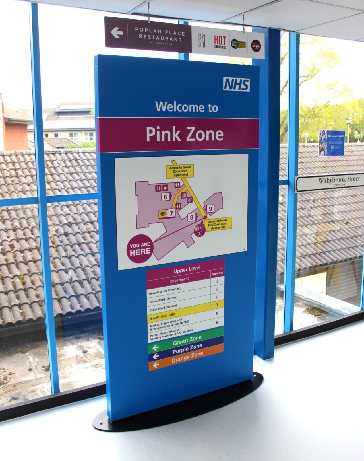
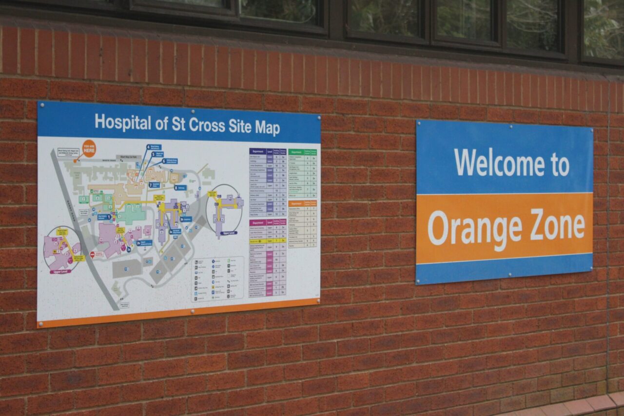
The colour system was incorporated into the mapping system throughout the site in order to reinforce the colour zones and help people identify the different areas and departments. Under the guidance of Graphic Signs, the design for the directional maps was finalised. It was up to Graphic Signs to decide where these should be placed both internally and externally to provide the best impact and help for visitors and patients.
Overall, the project included an impressive variety and type of internal and external Hospital Wayfinding Signage to overcome the challenges of the large site with so many buildings and departments.
• Interchangeable (external & internal), modular sign systems – ceiling, floor & wall mounted
• Architectural tray signage
• Internal and external totems
• Wayfinding maps
We implemented a modular signage system so that it can be easily updated and changed as needed. This helped to futureproof the system so that changes could be made if needed without the entire set of signage needed to be overhauled again for many years.
These modular signs also incorporated the colour coding system so that it worked seamlessly from the car park through to the section of the hospital and eventually to the department itself.
Contact the Graphic Signs Team today to update your building and site signage. We’re happy to work on bespoke projects and will act as a ‘one stop shop’ for the full project from design through to installation.
